Making rental applications easier to finish

A clearer path from application to submission.

Rental applications ask people to gather personal information, pay for screening reports, and send sensitive details to an agent. RentSpree’s previous experience made it difficult to track progress, catch mistakes, and know when the application was actually submitted.

The redesign focused on making those moments clear: helping applicants resume their work, review their details before reports were generated, and understand the difference between paying and submitting. Improving completion also supports a core part of RentSpree’s business.

Role
I led design for the project and built a working prototype with RentSpree’s design system and Claude Code so Product, Design, and Engineering could review the complete flow together.
Status
The 3.0 redesign launches in 2027. We’ll track total completion, completion after payment, and refund requests.
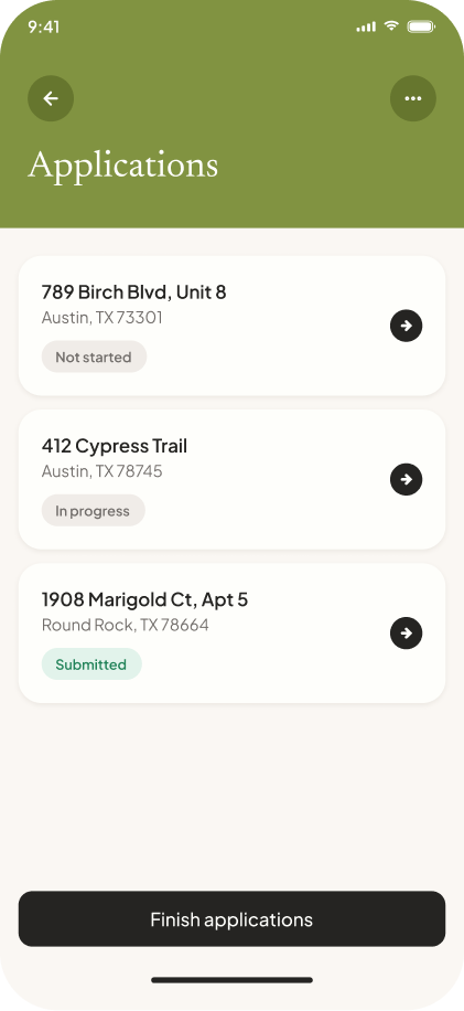
Applications list showing three rental applications: not started, in progress, and submitted.

The problem

Where applications break down.

01

Progress was hard to follow.

Applicants often stop to gather documents or confirm details, then come back later. The previous flow didn’t show how much was left or where to resume.

02

Errors surfaced after reports were generated.

Some applicants found mistakes in details they had entered themselves only after their screening reports had been generated. The previous flow gave them no clear moment to check their own information first.

03

Payment and submission were easy to confuse.

Applicants couldn’t tell when their application and reports had actually been sent to the agent. The experience could look finished while review and submission steps still remained.

Designed to be picked back up.

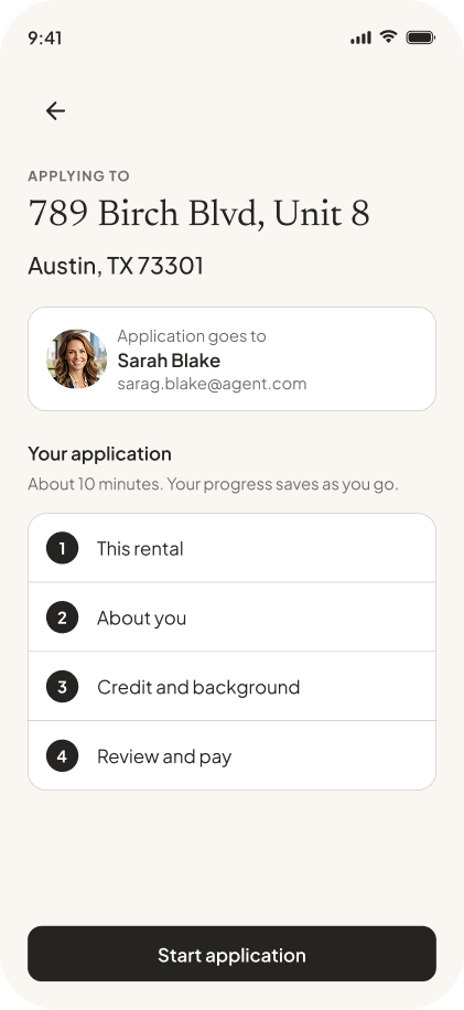
The overview makes completed and remaining sections visible, gives returning applicants a clear place to resume, and lets them edit completed sections directly.

  • Done, editable, and next

    A completed section shows a check and an Edit action, so fixing an answer never means walking back through the flow. The current section keeps its number, so what comes next stays clear.

  • Continue, not start over

    Start application becomes Continue when someone returns.

  • Know who receives it

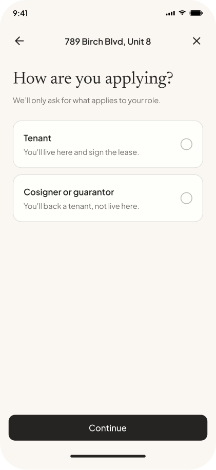
    The agent receiving the application is named at the top. Applicants are sharing sensitive financial information, so they should know who will receive it.

  • Keeping progress predictable

    Conditional questions expand inline, so the overview keeps its four main sections. Additional adults receive their own application, and the optional count of occupants under 18 is used only for household size.

Catching errors before they cost money.

Support requests showed that some applicants discovered mistakes in their own information only after screening reports had been generated. Field validation could not catch every incorrect detail, so the redesigned flow adds a full review before payment starts the reports.

  • Small, specific mistakes

    A misspelled legal name, an outdated address, a transposed digit. The review helps applicants check what they entered; it can’t resolve inaccuracies that originate in the reports themselves.

  • Edit from the review

    Every section can be edited directly from the review page.

  • Before the reports run

    Applicants can correct their details before payment triggers report generation.

  • Name the recipient

    “Check everything before it goes to Sarah. You can still edit.” One line names who will receive the application and says there’s still a chance to edit.

Making payment make sense.

An earlier version moved payment to the beginning. Payment conversion increased, but the change did not solve abandonment, and refund requests rose. Applicants could still mistake payment for completion.

The redesigned flow separates the commitments: review application details, pay to generate reports, review those reports, then submit to the agent.

  • Review, then pay

    Payment comes after the application review.

  • Paying isn’t submitting

    The page says paying starts the reports, and that applicants will review them before sending the application to the agent.

  • A clear total

    The total shows what the fee includes, including the optional reusable package.

Hypothesis

If applicants understand what each step commits them to, fewer will mistake paying for submitting, and more will finish the application.

How we’ll evaluate the redesign

The 3.0 redesign launches in 2027. After launch, we’ll track three measures. Total completion shows whether more applicants finish. Completion after payment shows whether people who pay go on to submit. Refund requests show whether applicants understood what they were paying for.

A working prototype for shared review

Using Claude Code and RentSpree’s design system, I built the application as a working prototype instead of a series of static screens. Product, Design, and Engineering could move through the connected flow together and assess its content, navigation, and the transitions from review to payment to submission.

From applicant to tenant

A clearer application also gives agents and landlords better information to screen with. Beyond the application, there’s a broader opportunity: if applicants choose to save a payment method, it could make deposits and rent easier after approval.

Applicant experience
V1

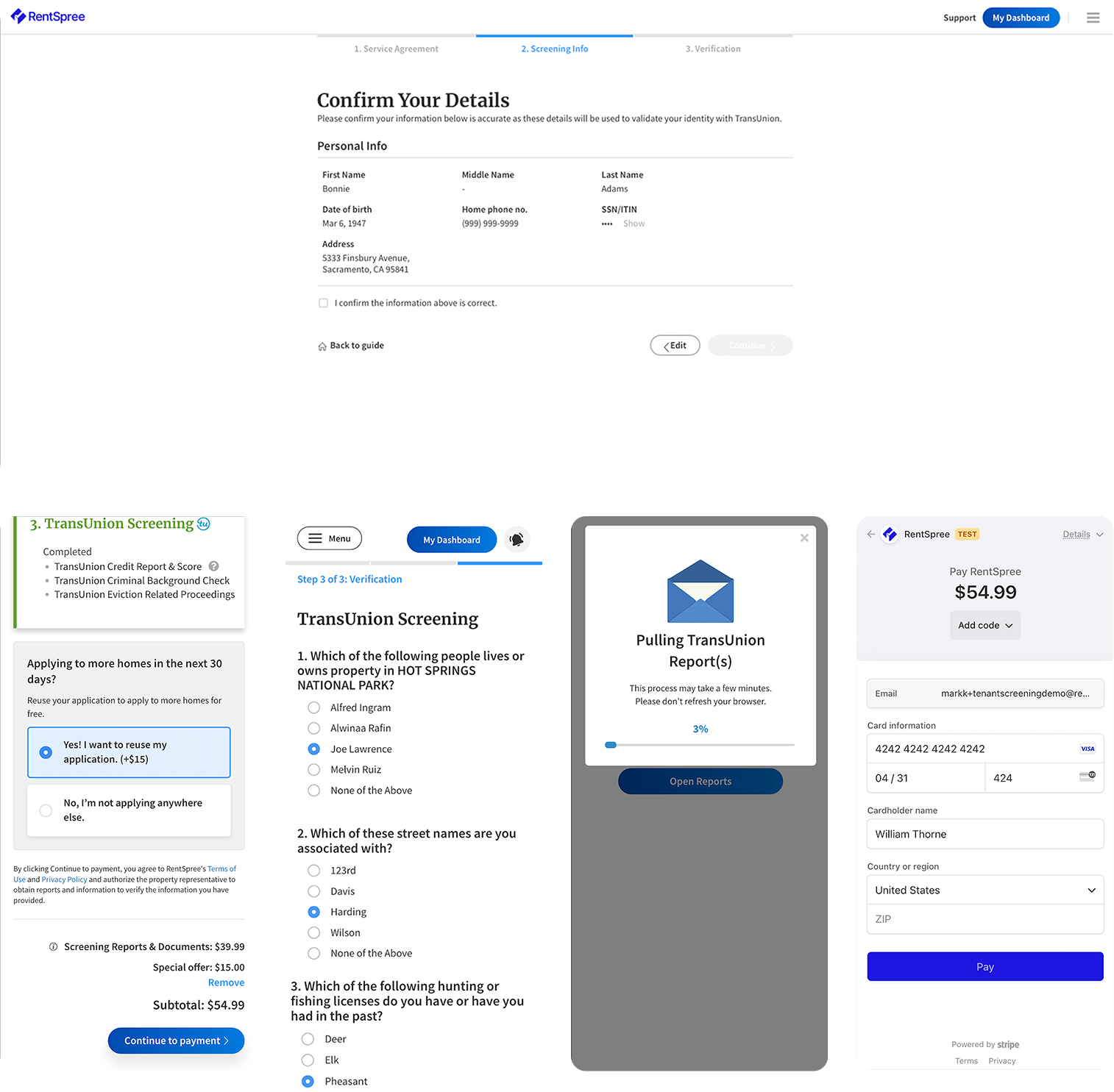
The original RentSpree application flow: a desktop identity-confirmation screen, then mobile screens for TransUnion screening questions, the reusable-application upsell, the report-pulling loader, and payment.