Lincoln Digital
Lincoln Digital
Lincoln Digital
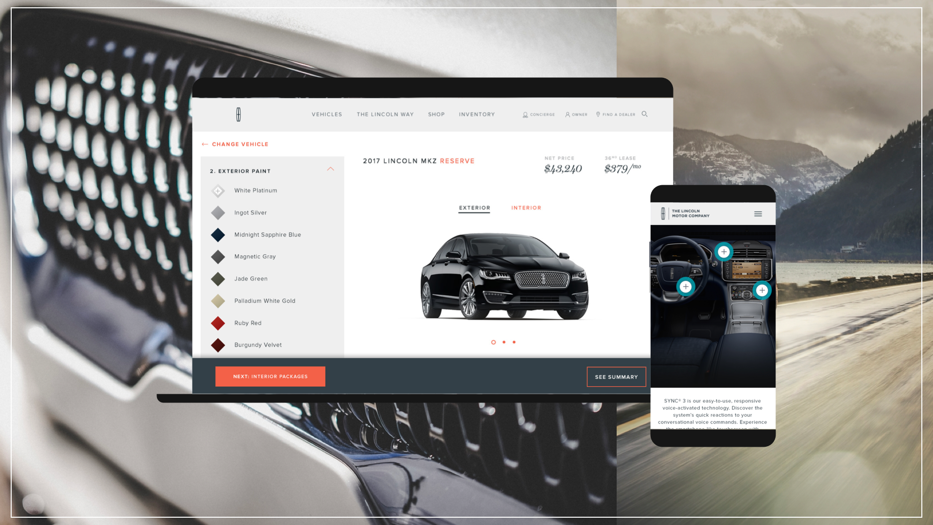
At the heart of this project was the “Build and Price” tool—a cornerstone of Lincoln.com traffic and a pivotal touchpoint for prospective buyers micahburger.com+1arcd.ku.edu+1. Our goal: transform it into a seamless, engaging, and luxurious online experience befitting Lincoln’s premium brand.
Lincoln.com sought a fresh experience to engage shoppers with their latest luxury lineup. My mission was to redesign the popular “Build and Price” feature, where users customize and bring their dream Lincoln vehicle to life.
Lincoln.com needed a new experience to educate shoppers on luxury brand’s latest vehicle lineup. My mission was to redesign “Build and Price,” a highly trafficked part of the site where users create and customize their dream Lincoln vehicle.
The Challenge
Working with a small digital team, my goal was to create a responsive and user-friendly experience that made it easy for users to explore pricing and key features—while also bringing the spotlight to the core feature: enabling users to customize their ideal Lincoln vehicle.
The Challenge
Working with a small digital team, my goal was to give users a simple and responsive way to digest pricing and other essentials -- but the hero feature was allowing users to customize their Lincoln car.
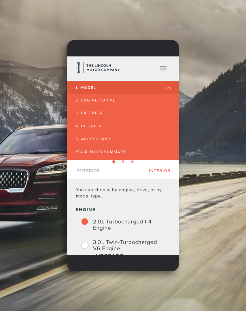
We ran multiple rounds of user testing to uncover core buyer motivations. Three major needs emerged:
Clear, intuitive pricing – Users demanded a transparent, easy-to-understand cost structure.
Customizable features – Users valued the ability to add specific features to their vehicle.
Seamless delivery scheduling – After customization, users wanted the option to schedule a delivery to their residence.
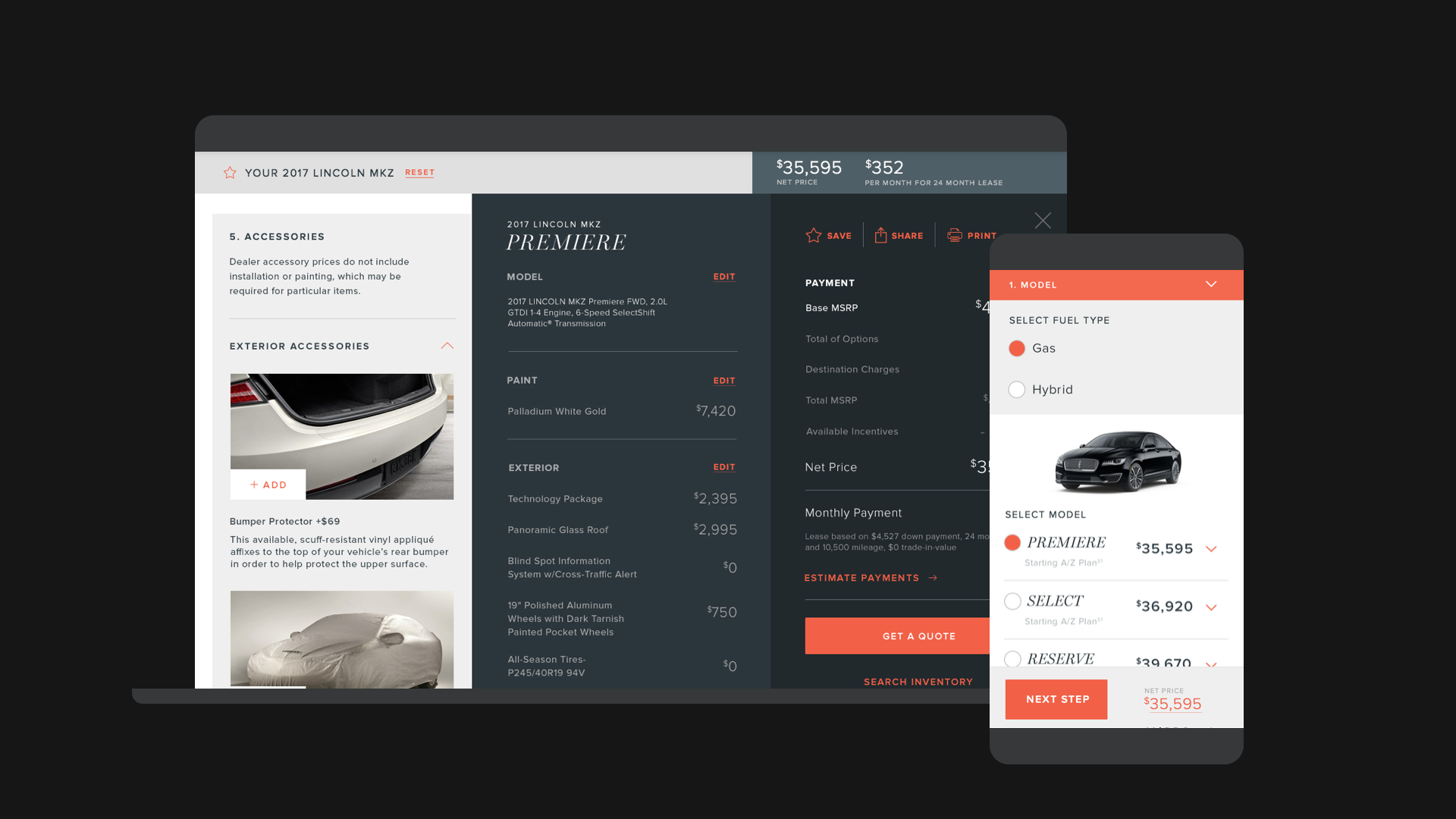
By streamlining these friction points—pricing clarity, configurability, and at-home delivery, we optimized the digital buyer journey. In A/B testing, this resulted in a marked uptick in engagement and a significant boost in vehicle purchase rates when compared to the legacy experience. Research in automotive digital retail confirms that simplified UX, vehicle personalization, and end-to-end online tools drive higher conversions
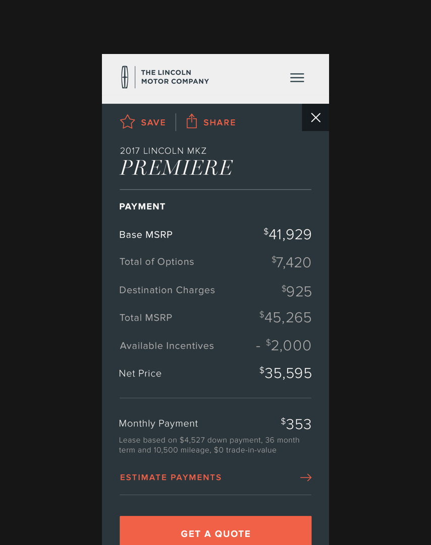
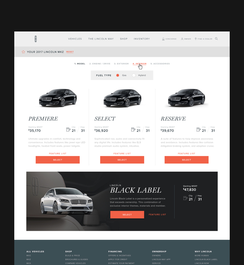
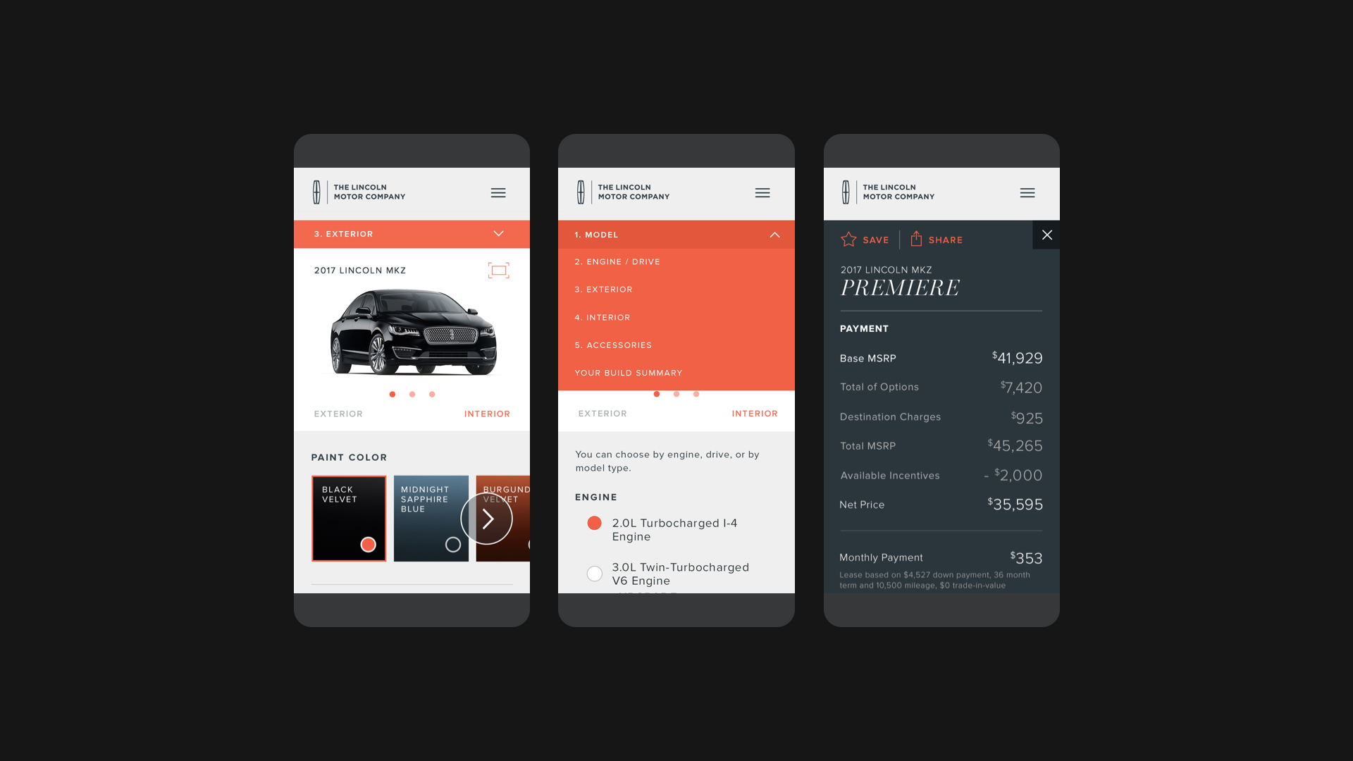
The redesigned “Build and Price” tool introduced cross-device functionality, allowing users to start customizing on web and continue on mobile. On mobile, a progressive dropdown enabled easy navigation, letting users move between steps to add or edit features and models. This seamless experience increased accessibility and flexibility for users.
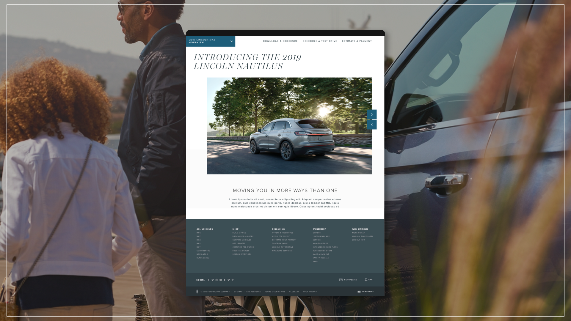
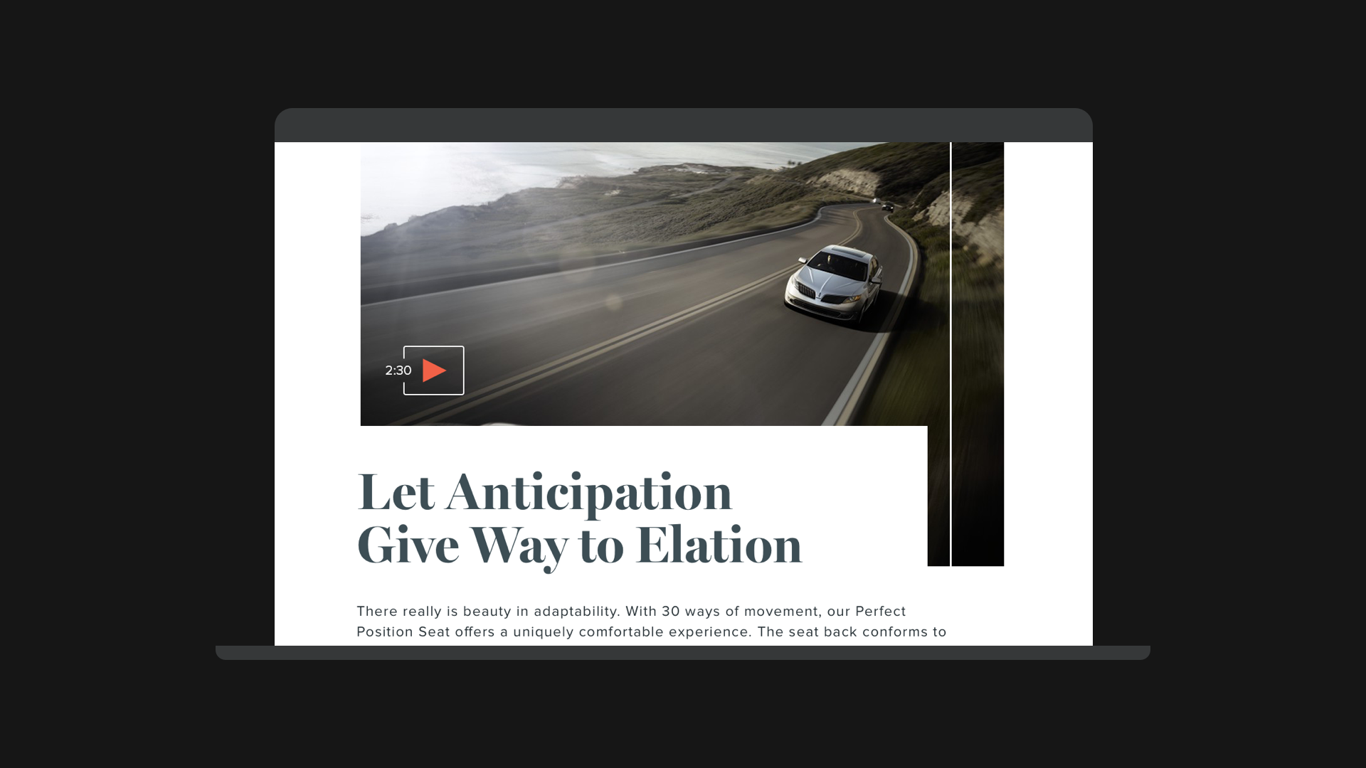
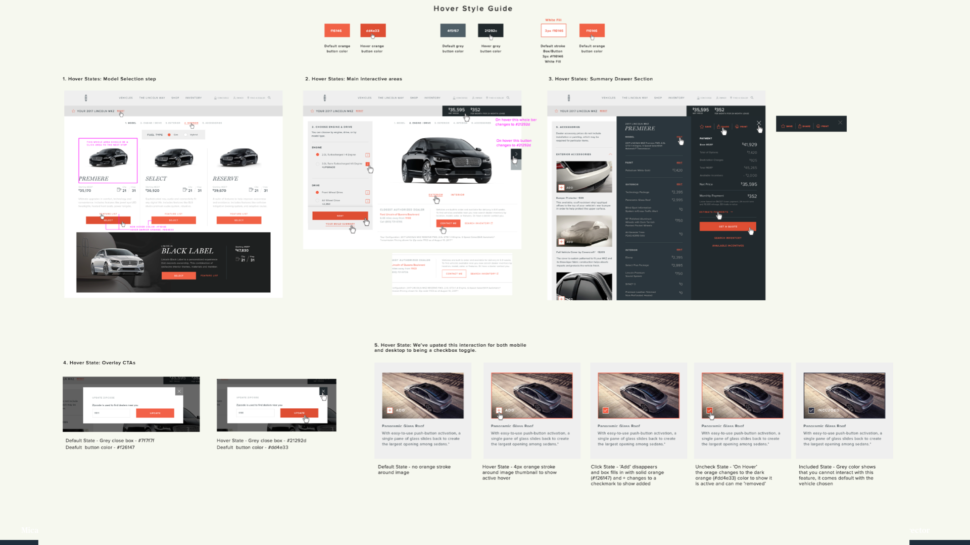
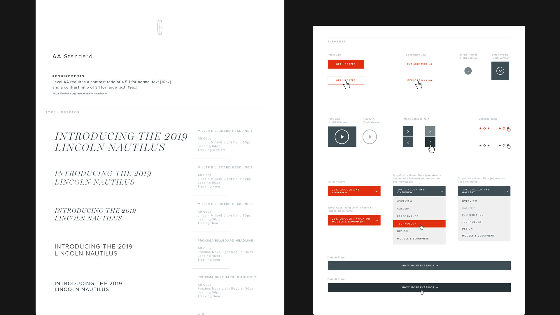
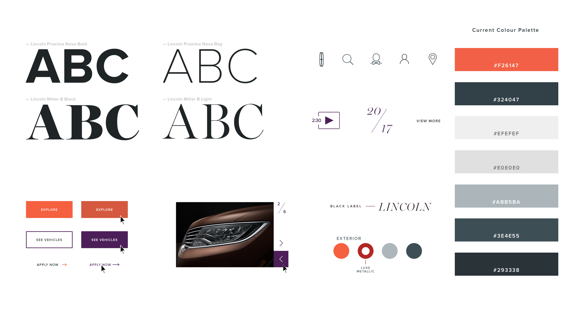
A core initiative was developing a comprehensive, accessibility-focused style guide, which we transformed into a component library for key screens and detail pages. I led a Jr. Designer in creating an interactive guide with animations, hover states, and transitions. Additionally, we collaborated with marketing, art directors, and copywriters to plan a cohesive launch.
Project Team:
Micah Lindenberger - Art Director / Product Design
Natalie Cho - Art Director / Product Design
Paul Mathisen - Product Design
Hassan Karimi -User Experience
Heather Tafel - Project Manager
Micah Lindenberger
Product Design
Interaction Design
Art Direction
Creative Strategy
Illustration
Micah Lindenberger
Product Design
Interaction Design
Art Direction
Creative Strategy
Illustration
Find me in Los Angeles, CA
micahmicahdesign@gmail.com
Designing machines & systems since 2005
Ciao.
Built in Brooklyn, NY ©2024