Redesign of Opendoor’s seller experience
Redesign of Opendoor’s seller experience
Redesign of Opendoor’s seller experience
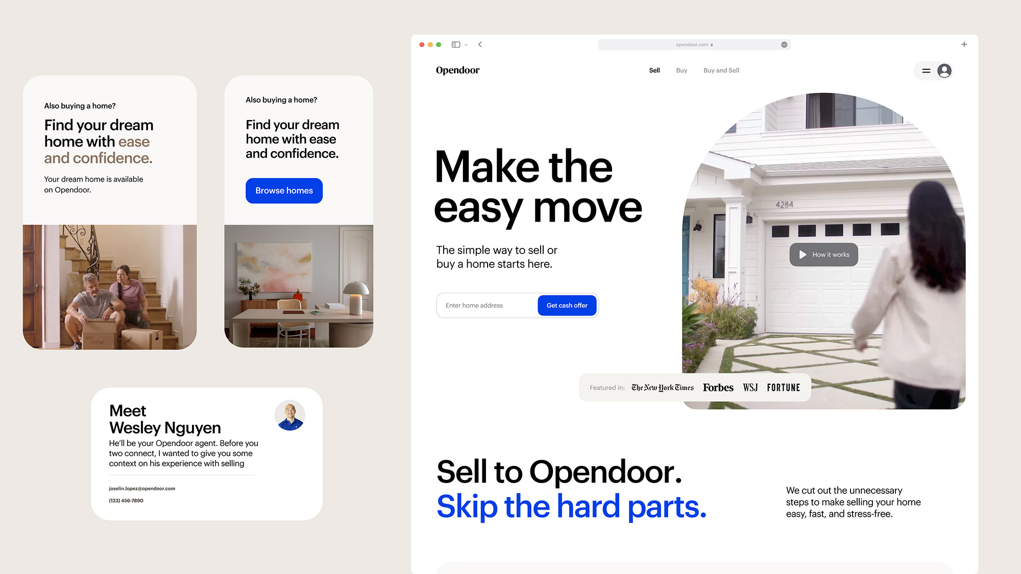
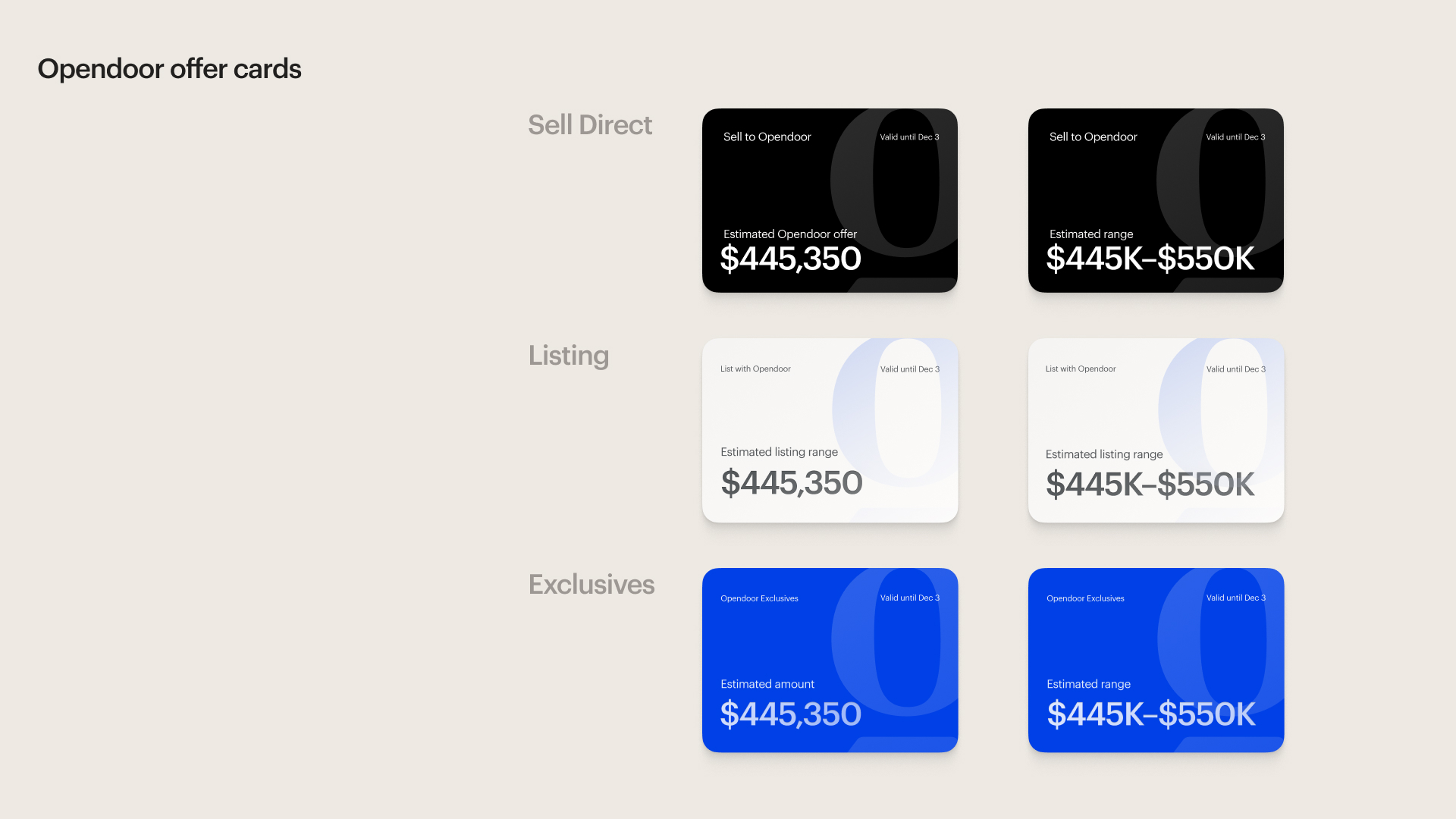
Opendoor aimed to simplify home selling, but the addition of ‘List with Opendoor’ created a new challenge: how to seamlessly integrate these distinct pathways.
I led the redesign of the seller experience, working across teams to unify the flow from offer to closing while also refreshing Opendoor’s visual and interaction design standards. This project set the foundation for a more cohesive design that would scale with the platform’s evolving needs.
Objective: To create a cohesive, flexible experience for home sellers, integrating the option to list on the market with Opendoor’s cash offer.
Role: Led the redesign and managed cross-functional collaboration across Product, Design, and Engineering
Key pain points & customer insights
Limited price transparency
Sellers often lacked a clear understanding of their home’s value and how Opendoor’s offer compared to other market options. Without easy-to-access price comparisons, users felt uncertain about the fairness and value of the offer.
Rigid experience for diverse seller needs
Sellers have different motivations, such as needing to sell quickly or waiting for a favorable market, but the experience did not accommodate these varying preferences. Without flexibility, the platform felt one-size-fits-all and missed an opportunity to personalize the journey.
Unclear differentiation of Opendoor’s benefits
Users struggled to see how Opendoor’s unique advantages—such as a faster, simpler selling process—set it apart from traditional real estate options. This lack of clarity made it difficult for sellers to fully appreciate the value Opendoor could provide.
Inconsistent and disjointed navigation
Prior form designs and navigation lacked standardization, leading to a fragmented experience that could increase user frustration and abandonment rates. This issue was particularly problematic on mobile, where ease of use is critical.
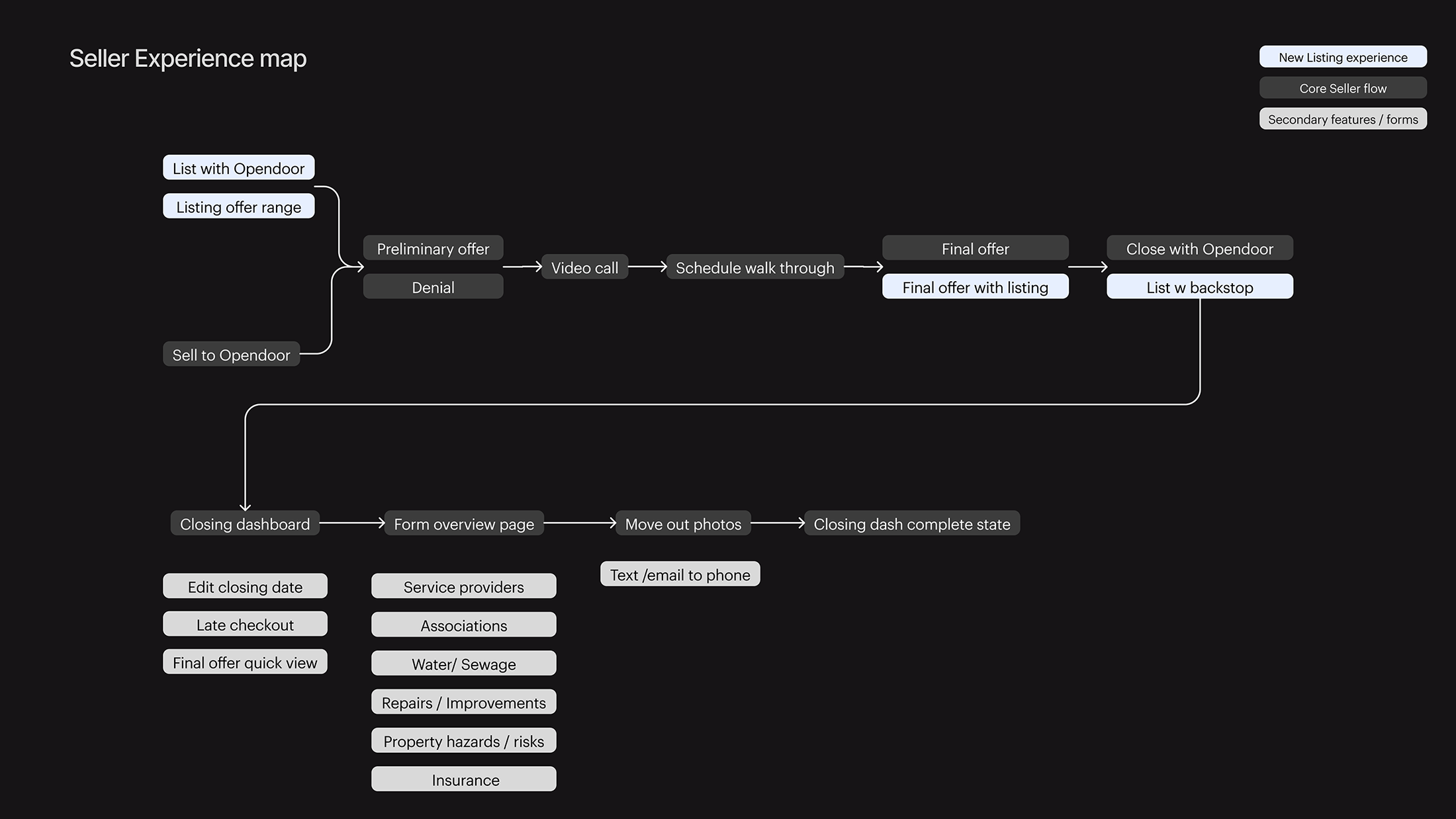
Enhancements to the user journey
To address these issues, we focused on enhancing clarity, personalization, and consistency.
To address these issues, we focused on enhancing clarity, personalization, and consistency.
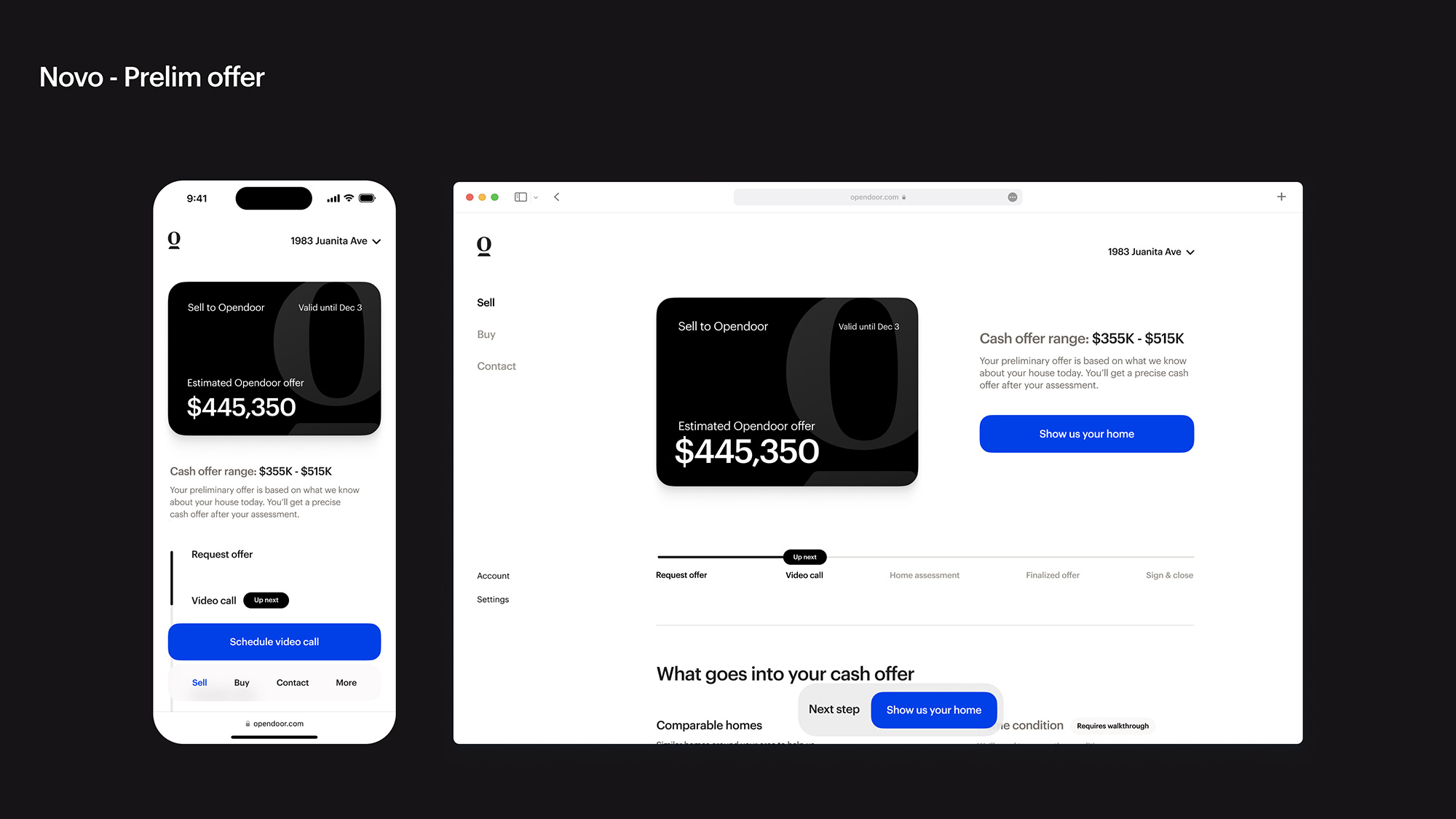
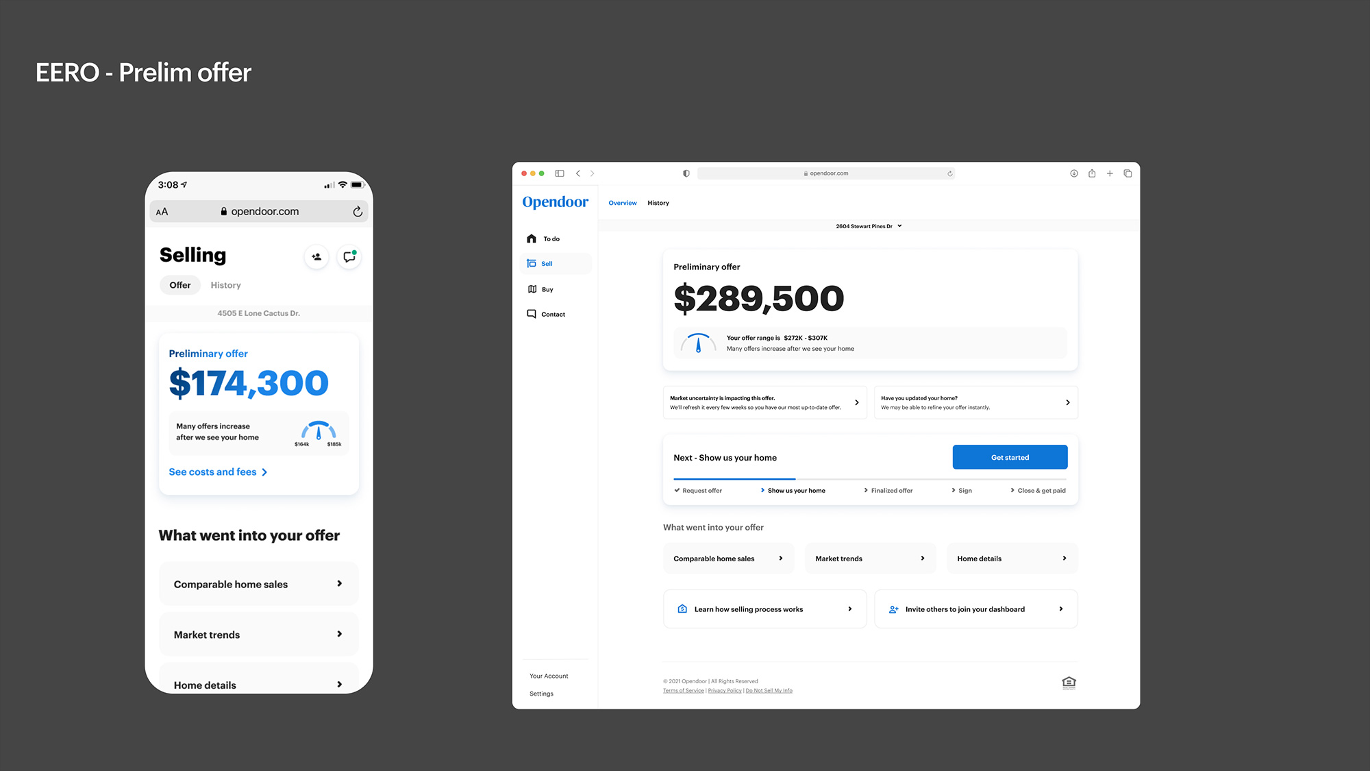
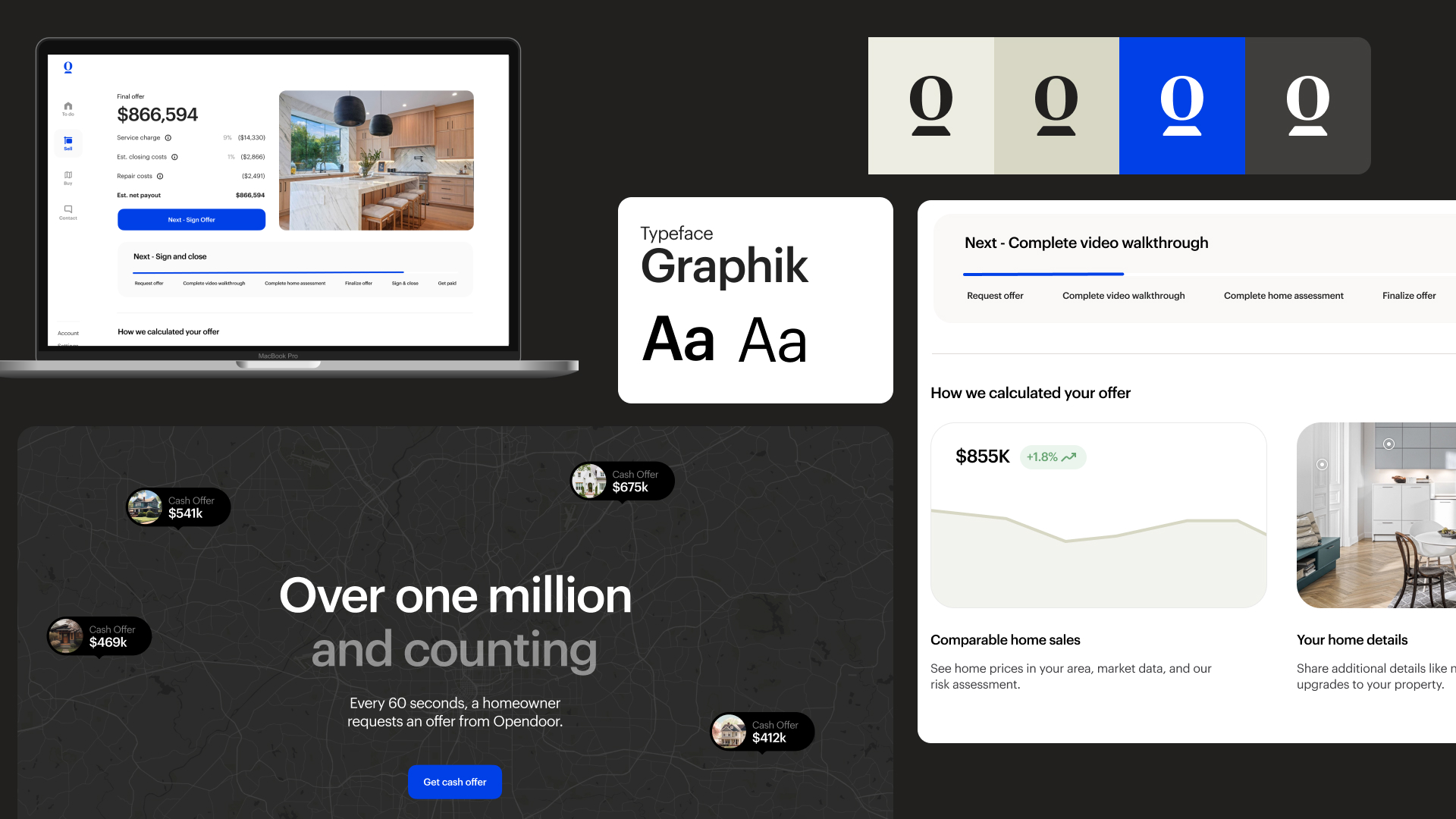
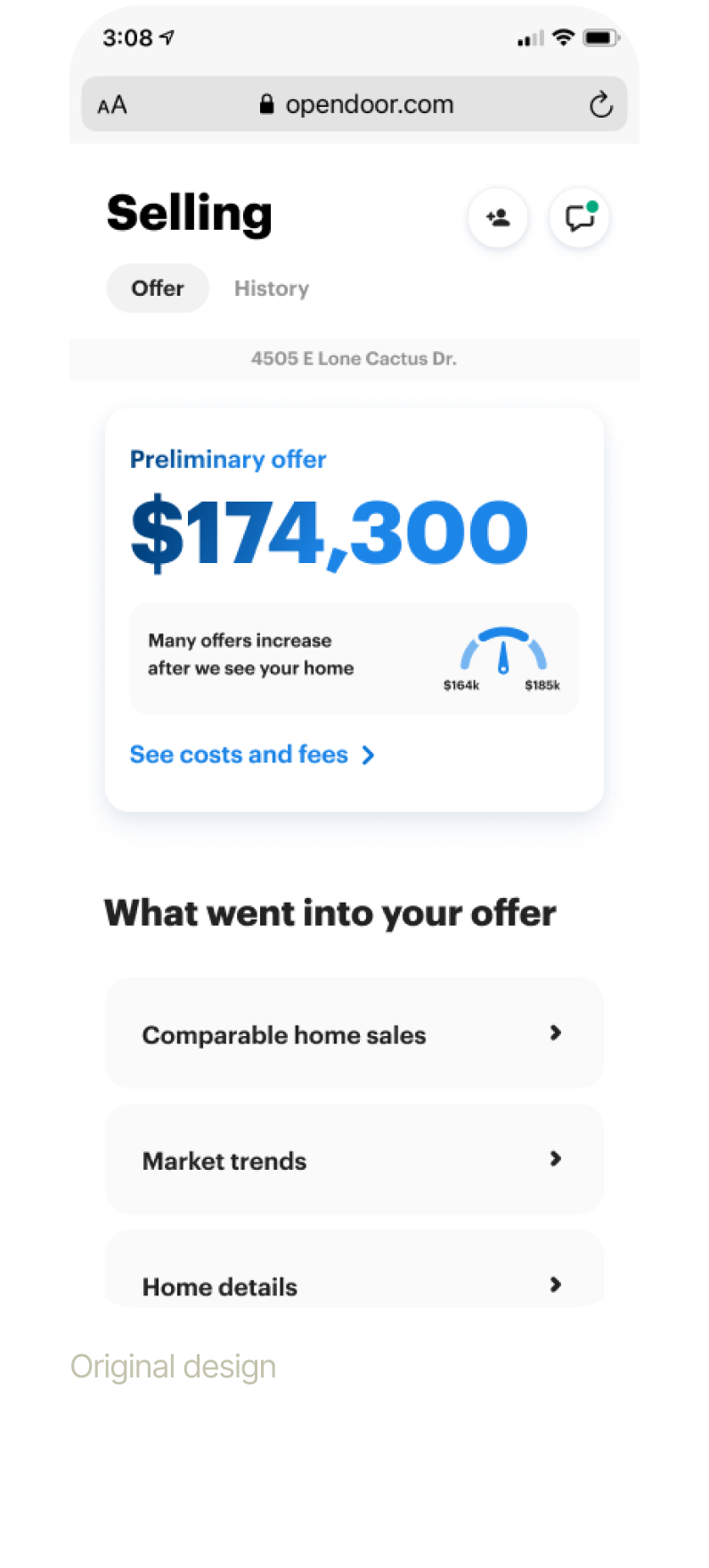
After onboarding, customers arrive at the preliminary offer page, designed to guide them toward the next step: scheduling a video call. Through iterative user testing, this page evolved into a clear and engaging experience, communicating three critical points: the preliminary offer price, the key factors influencing the offer, and the next steps in the process. This redesign ensures customers feel informed, confident, and empowered to proceed toward closing on their home.
Price Comparison Tool
We introduced a side-by-side price comparison feature, allowing sellers to easily understand how Opendoor’s offer compares to other options, building transparency and trust.
Enhanced Messaging
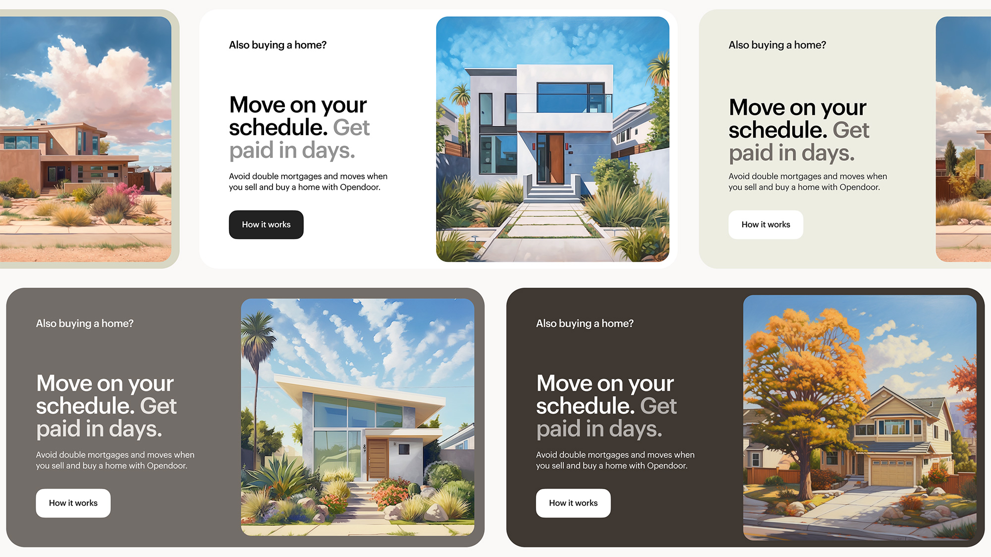
Clear, targeted messaging highlighted Opendoor’s unique value proposition as a streamlined alternative to traditional real estate.

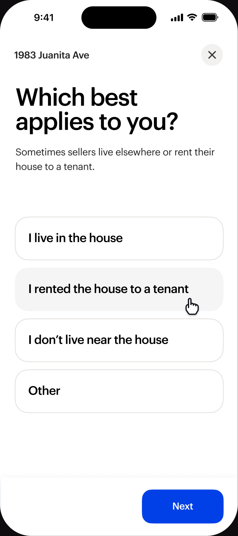
Personalized Selling Options
Added options for flexible closing and move dates
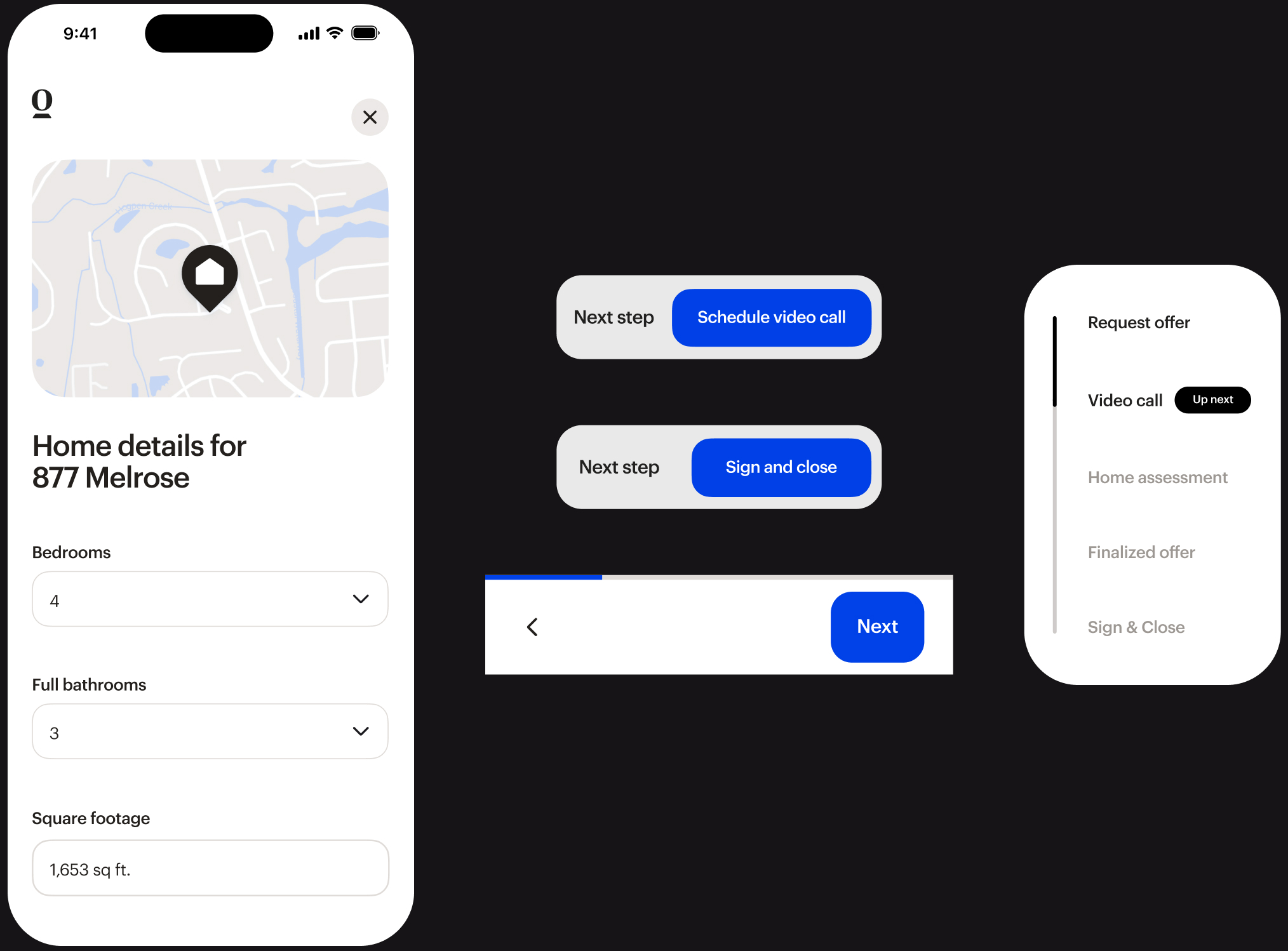
Standardized Forms & Navigation
Redesigned forms with consistent layouts and locked “Next” CTAs simplified the user flow, reducing friction and abandonment.
Understanding customer journeys
Enhanced backend integration with frontend forms provided greater insight into where customers were in their journey, helping us anticipate and meet their needs.
Clear path to completion
Previously, multi-path flows created confusion. The new flow prioritized a prominent, locked “Next Step” CTA, making it clear what users needed to do to progress.
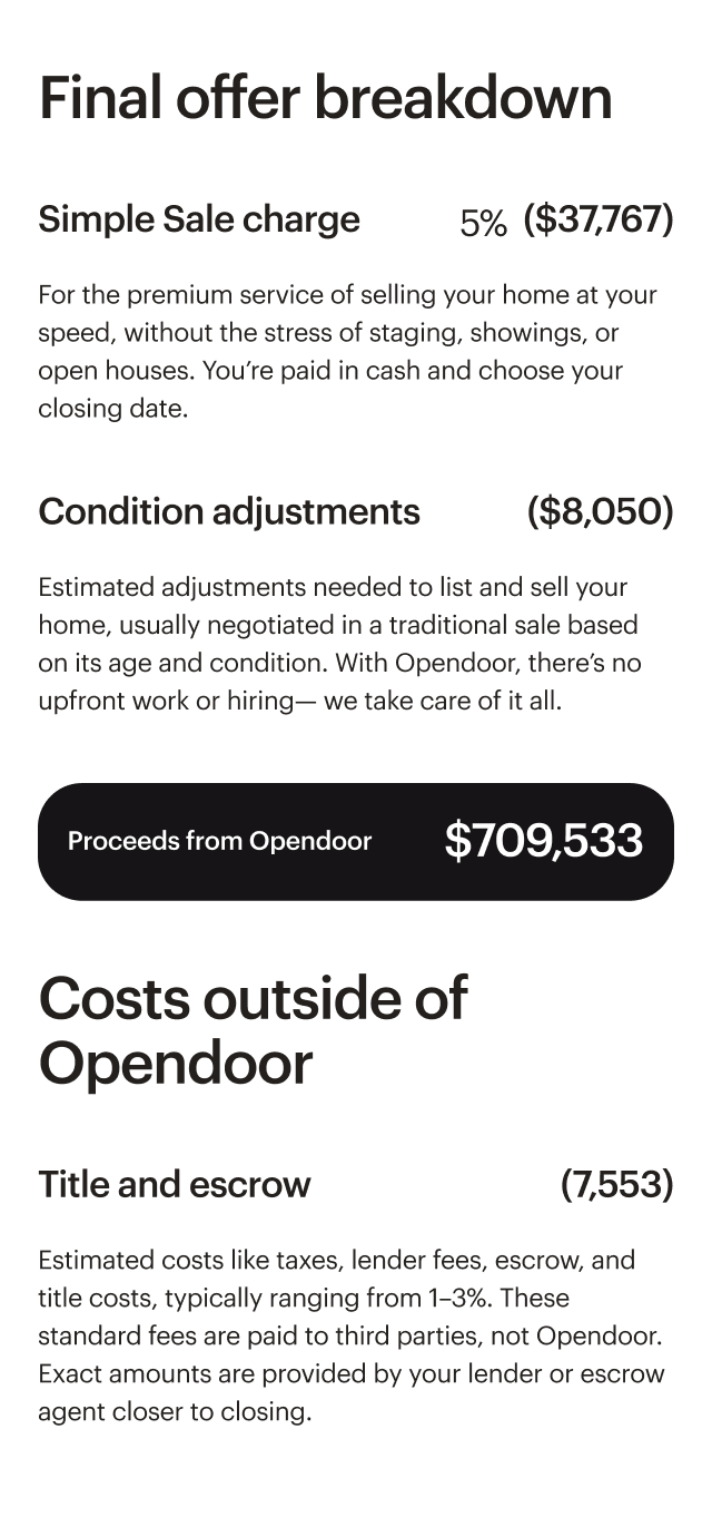
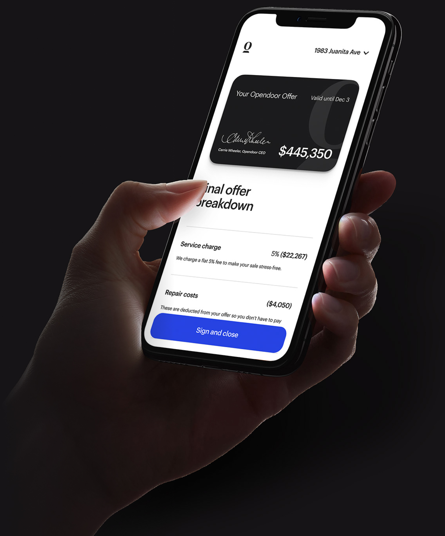
Transparent offer breakdown
We added a detailed “What Went Into Your Offer” section, providing users transparency into our pricing and fee structure to increase confidence in the Opendoor offer.
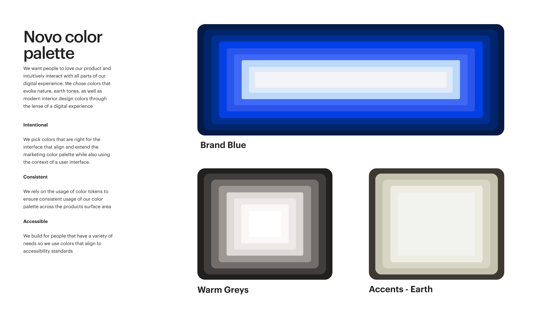
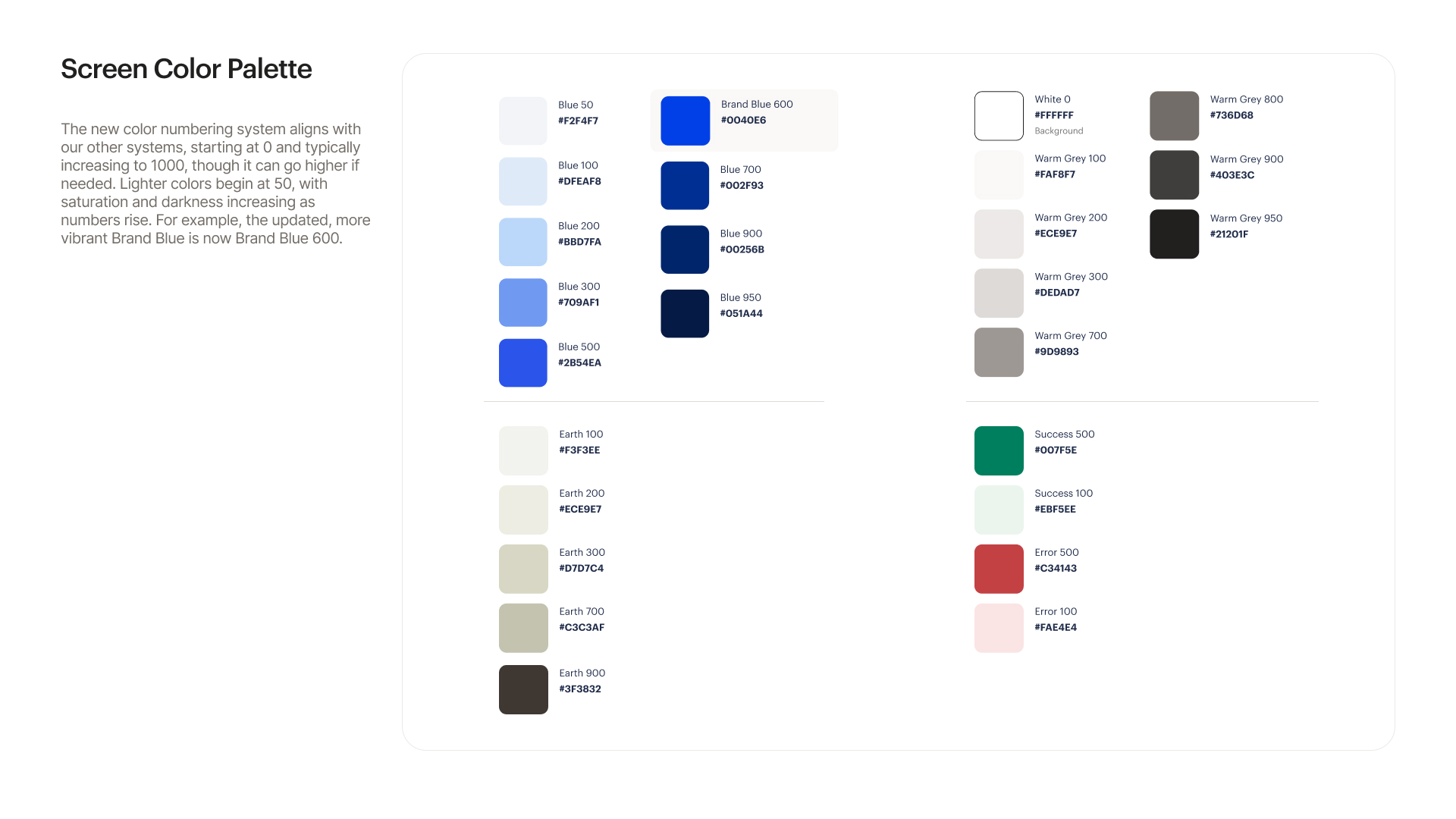
Tokenized art direction
The new visual style (named Novo) was tokenized, allowing for easy updates across the design system, making it efficient for teams to maintain consistency in future iterations.
Learnings and outcomes
Confidence Through Clarity
Consistent forms, intuitive design, and user-tested content created a seamless flow, empowering sellers to progress confidently with clear and actionable next steps
Empathy for User Needs
Building flexibility into the platform allowed users to have options to sell their home, leading to reduced frustration and a sense of support throughout the home-selling journey.
The Power of Transparency
Providing clear, upfront details about pricing and comparisons fostered trust, empowering users to feel confident in their choices and reinforcing Opendoor’s value.
Business impact
Increased customer engagement, with a 22% rise in initial video call scheduling and a 12% lift in final offers received.
Customer Impact
Faster closings, with the average process shortened by 3 days, reducing stress and improving the overall customer experience.
