Lattice: A generative layout playground
Redesign of Opendoor’s seller experience
Lattice: A generative layout playground
Lattice: A generative layout playground
Lattice is an experimental layout tool that blends structure and creativity. Inspired by the golden ratio, it generates adaptive grids of image containers at varying sizes and densities. With simple controls, it can shift from strict square grids to editorial-style layouts, making it useful for everything from news sites to curated shops, moodboards, or zines.
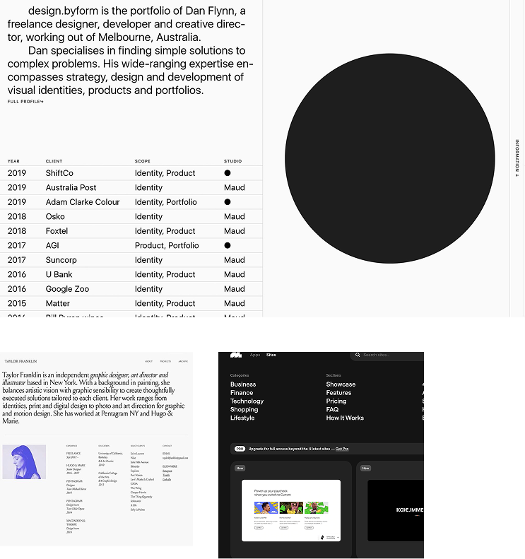
Samples of initial inspiration: blending imagery, type, and layouts
INCEPTION
The idea for Lattice began with my passion for editorial design and my background designing for news organizations like the BBC. I was fascinated by how structure and rhythm shape storytelling on the web.
I wanted to see if the golden ratio, long used in art and architecture, could inspire a generative layout tool for the digital space. The vision was to create scalable containers that shifted in size and density, a system that could bring variety and adaptability to everything from news pages to moodboards, zines, and curated shops.

Initial design concept before building the prototype
RANDOMIZED FOUNDATIONS
The first step was building a system that could simply shuffle layouts on its own. I worked in Figma Make to prototype grids that randomized container positions and sizes, starting with nothing more than color blocks. Even at this early stage, it was clear how playful and surprising the results could feel, almost like rolling dice for a web page.
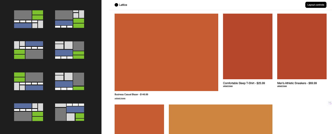
Exploring adaptive grid structures based on the golden ratio
ADDING CONTROLS
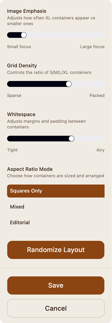
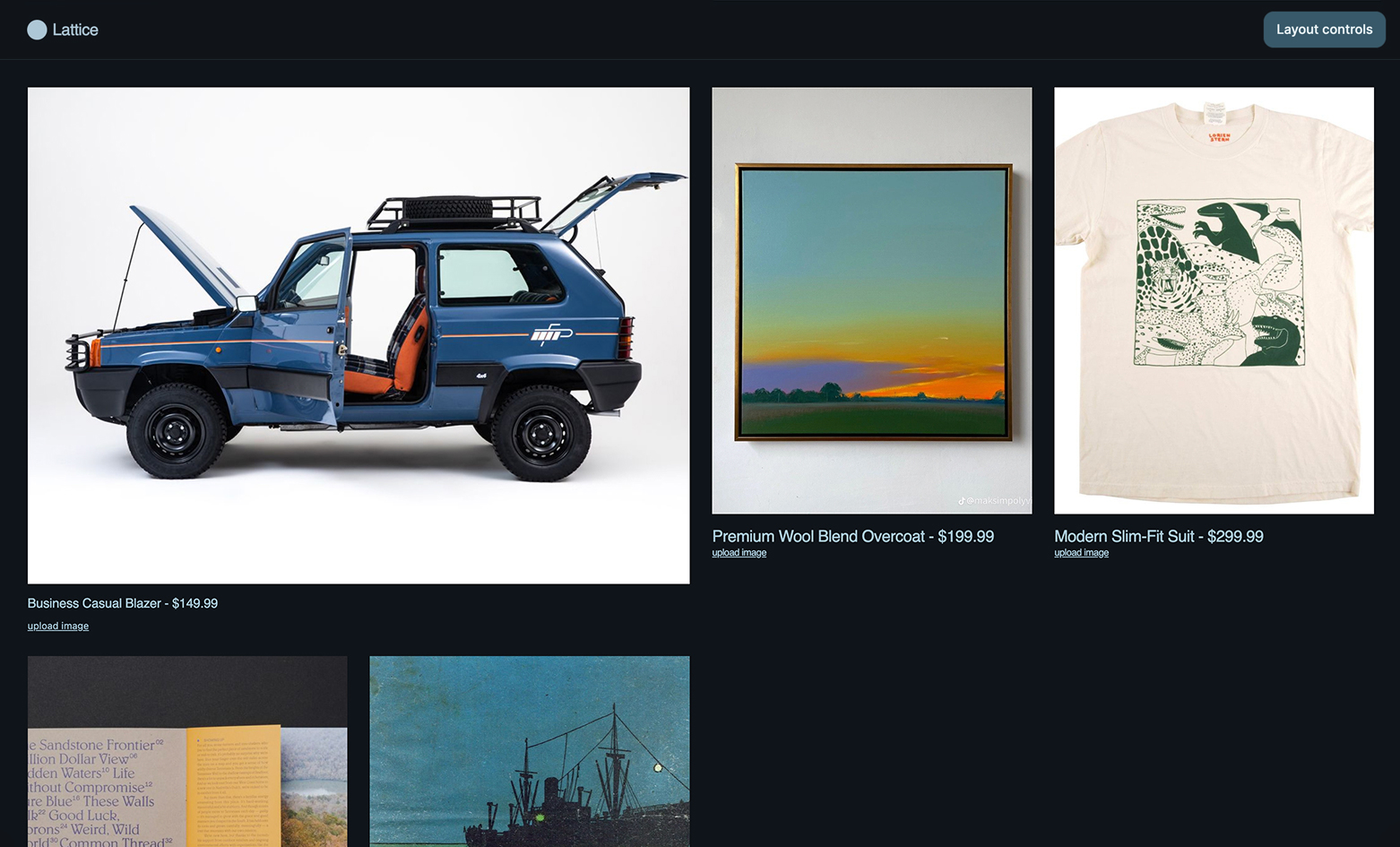
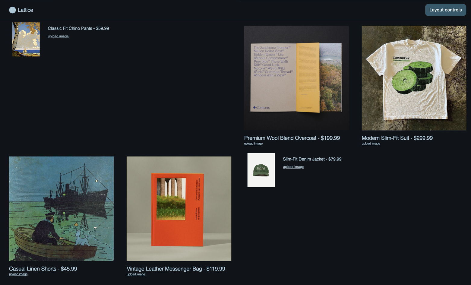
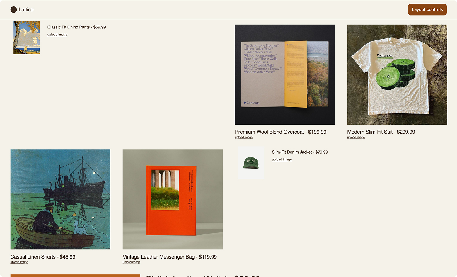
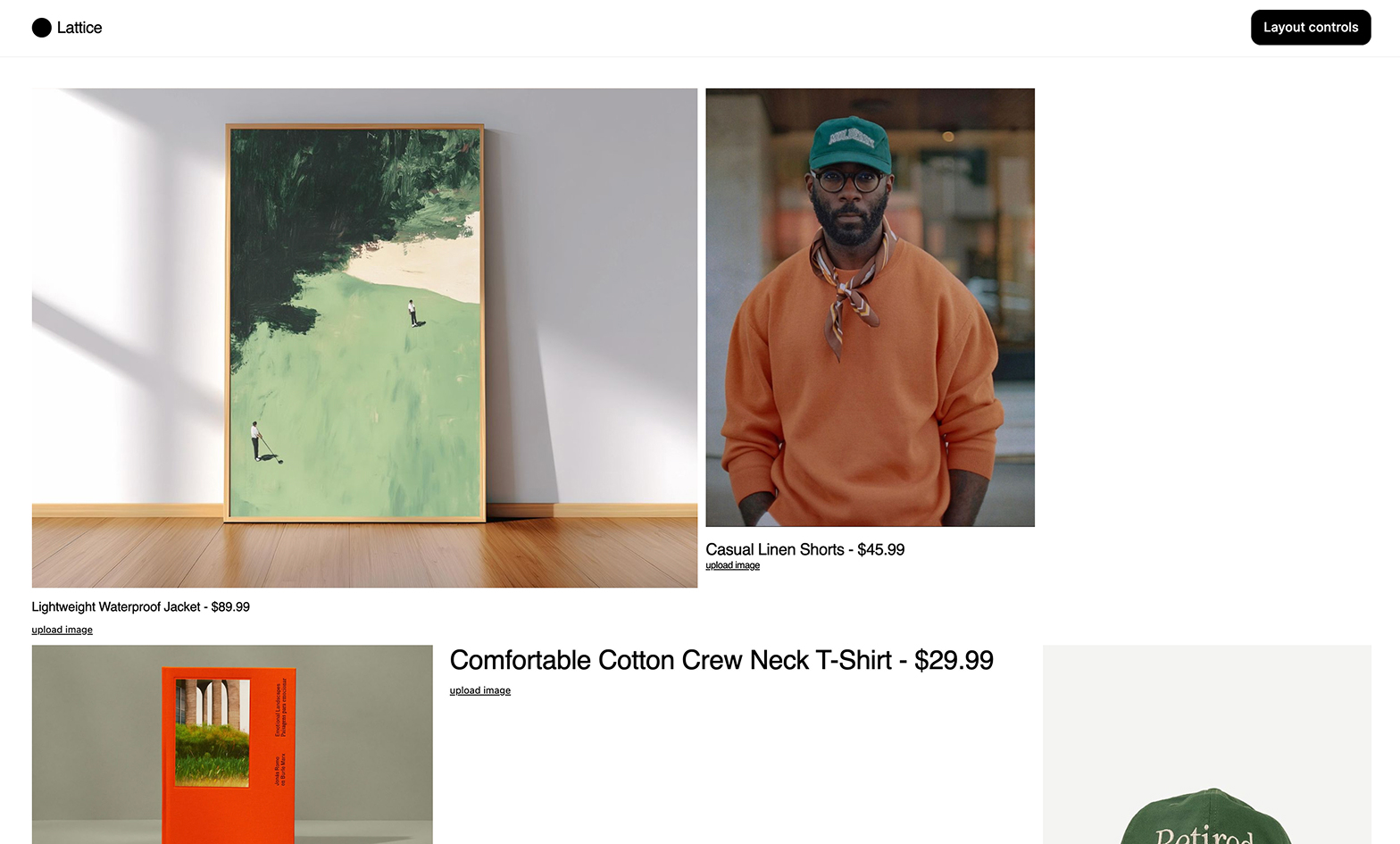
Once the randomization worked, I wanted to give users more steering power. I layered in controls for container styles, from strict square grids to more editorial mixes, along with the ability to scale blocks from small to extra-large and insert section breakers for rhythm. These additions struck a balance between order and variety, letting layouts feel both intentional and alive.
THEMES AND STYLES
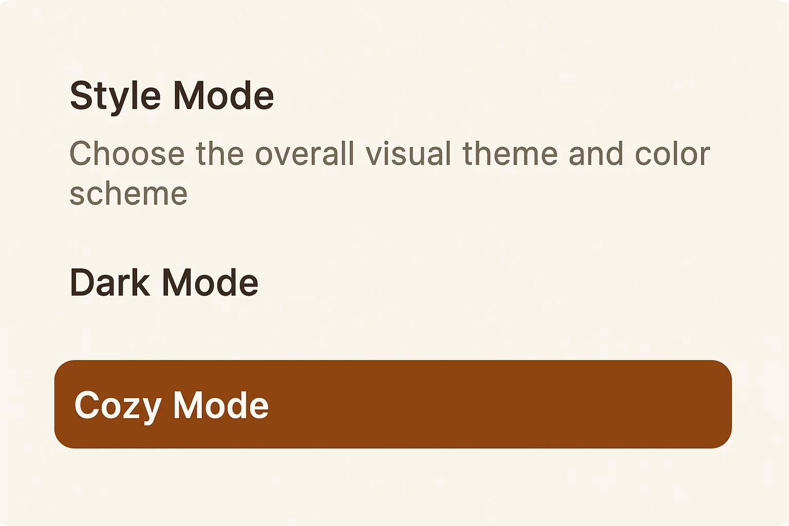
With the structure in place, I turned to style. I added a set of color themes including light mode, dark mode, and a softer cozy mode to give layouts an instant sense of character. These simple switches made the tool versatile enough to lean minimalist or expressive depending on the context.
NAMING AND REFLECTION
As the prototype matured, it needed an identity. I landed on the name Lattice, a word that captures both the structural framework of the grid and the creative freedom that plays within it. Lattice became more than a personal experiment. It proved that layout design does not have to be static. It can be generative, adaptive, and playful, opening new possibilities for how we build and experience the web.
